01 / PRIMARY WORDMARK
Primary logo

THE .STKR IDENTITY
A small way to express your taste.
Through shape, texture, and a single sticker.
Meet the .STKR identity through
marks, letterforms, and the feel of paper.
01 / MARKS
Logo 1, with letters inside ovals, is the primary .STKR wordmark. The condensed logo 2 is the secondary mark. Preserve both in their original color, #231815.
02 / COLORS
The space of White, the warmth of Cement, the calm of Pastel Sky, the clarity of Ink. Four colors from one shared palette let the mark take shape.
Click a color card to copy its HEX code.
03 / TYPOGRAPHY
Character in English headlines. Clarity in Korean body text. One brand voice, down to the smallest number.
English headings 700 · Buttons 600. Distinctive character, even in a few words.
Korean headings & buttons 600 · Body 400. Balanced, comfortable reading for longer text.
Numbers & identifiers 500. Small details, clearly defined.
04 / IN USE
A sheet of paper, a small label, a sticker to keep. One mark brings the brand to life across different surfaces.
.STKR BRAND NOTE
.
 PRESS
PRESS
WHITE PAPER
WARM BLACK MARK
05 / GUIDELINES & KIT
THE HYPURR.STKR IDENTITY
Physical collectibles.
Made to be yours.
Our kind of character, in a little sticker.
Meet the HYPURR.STKR brand.

01 / OUR MARK
Every angle, curve, and little detail.
Our original mark makes us instantly recognizable.
Original logo color: #73C5B7 — keep it original
02 / COLOR PALETTE
Wide open skies. A little mint.
Three colors, with room to breathe.
03 / TYPOGRAPHY
Character in the headlines. Clarity in the body.
Three typefaces, each with a role to play.
English headings 700 · Buttons 600
Bold character. A sticker kind of personality.
Korean headings & buttons 600 · Body 400
Familiar, comfortable reading.
Prices · Token IDs · Wallet addresses 500
Small details, clearly defined.
04 / IN USE
From a collection on screen to a sticker in your hand.
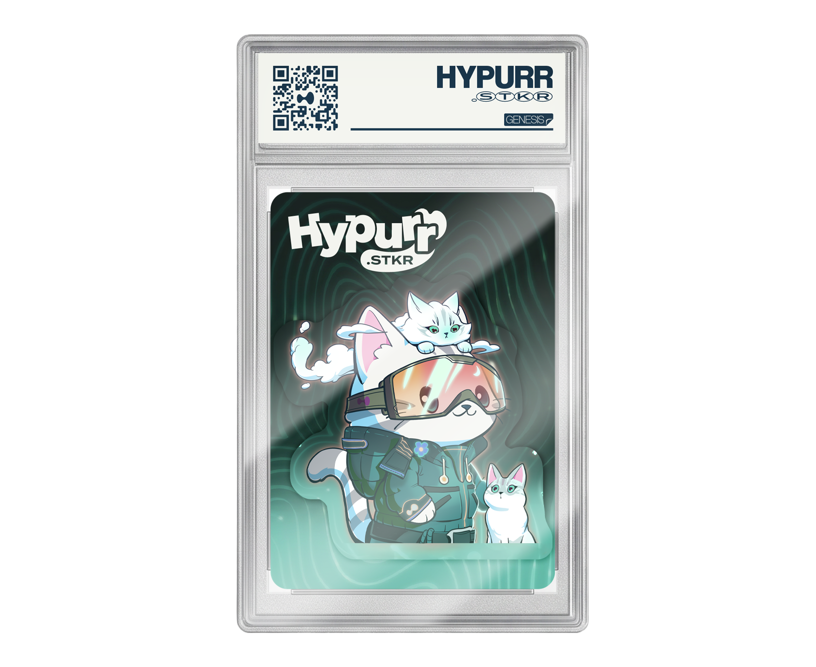
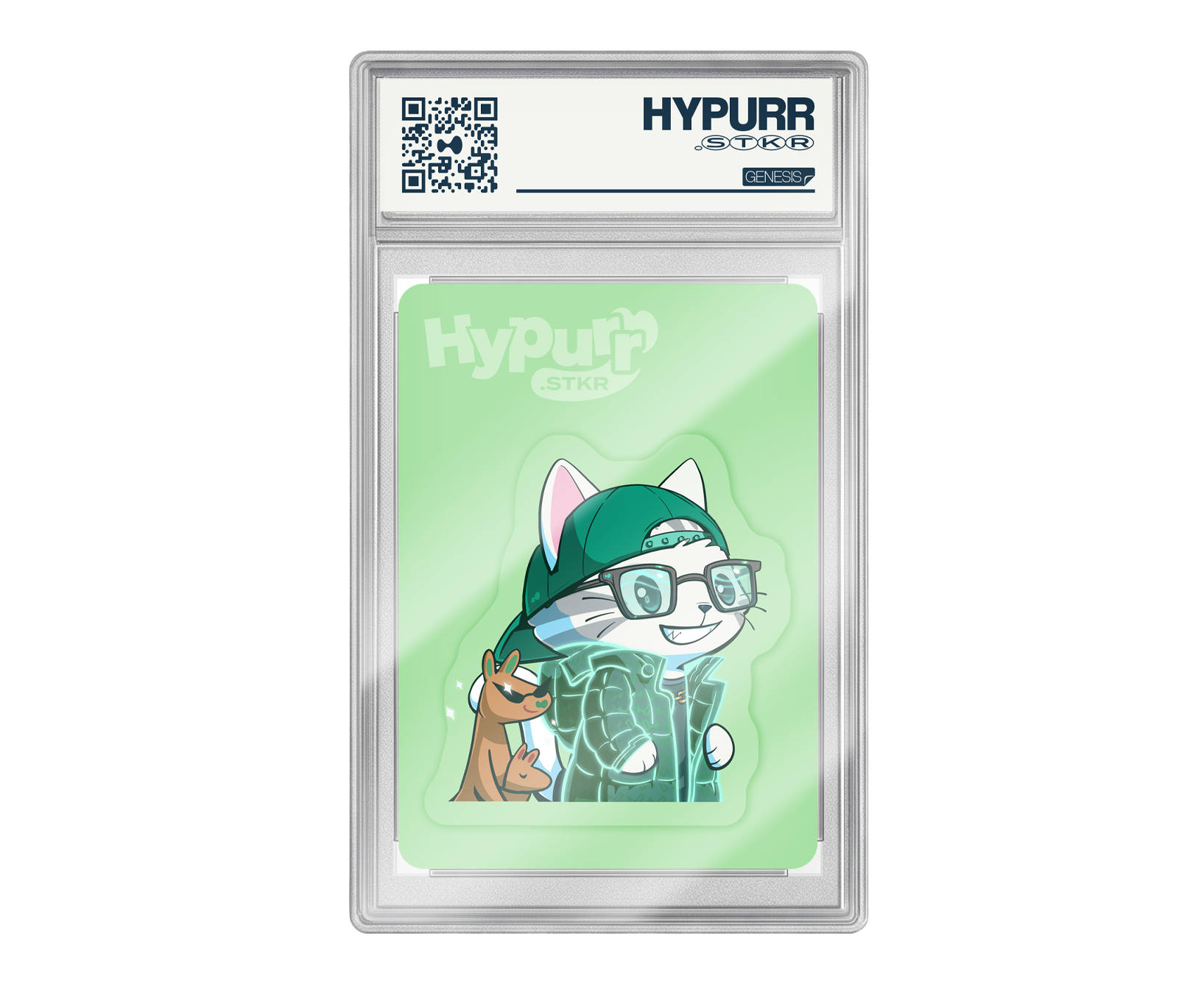
Original artwork, framed by our colors.
Good things
come in
stickers.
05 / GOOD PRACTICE
A few shared principles that keep us recognizable.
Give the logo plenty of clear space. Keep it away from crowded elements and leave room at the edges.
Preserve the logo’s shape and original color, #73C5B7. Keep NFT and product artwork in their original colors, too.
Use white for space, sky for broad backgrounds, and mint for small actions. Keep text dark on light surfaces.
The original logo mint stays #73C5B7. Use pastel sky #BFE5F7 for broad backgrounds and the existing UI mint #53D5B4 for buttons and small accents. It is the same palette the HYPURR.STKR app uses.
Use Bricolage Grotesque for English headings and action labels, and Pretendard for Korean headings and body text. Korean headings and buttons use weight 600; body text uses 400.
The kit includes the original SVG logo, the color tokens shared with the app, fonts and their licenses, and brand guidelines. NFT and product artwork shown in the examples is not included.
06 / BRAND ASSETS
Everything you need to keep it consistent.
SVG · FONTS · JSON · CSS · MARKDOWN